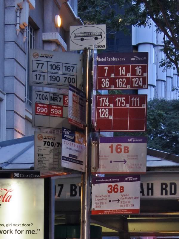
I saw both the Clementi MRT (town centre) and NP (standard) one
already.
the standard poles actually look kinda normal. it looks not much
different from the typical one and to me it just doesnt feel
"fresh" enough.
I believe the typical man-on-the-street uses the guide at the
bus stop and look at the respective letters and colour codes to
determine fares, so removing fare stages are no biggie to me.
and the area below the bus numberings are for SWTs and whatever
timetables that used to take up one plate and cram up the pole. its
a good idea to move it all below, though it ought to be more
prominent so people will realise that.
and why is it that they are "seeking feedback" without offering
avenues for us to actually do so?